A little while ago I met with a rather large (as in “publicly traded” large) and (despite their size) innovative software company. One of their Senior Vice Presidents told me that they recently started to design all their products (which are mainly for PCs and increasingly for the Web) using the mantra of “Design for Mobile First”.
This is an interesting point - during our discussion they pointed out that due to the specific limitations of mobile devices you often end up with less clutter (at least when carefully designed), more to-the-point interfaces (as you simply don’t have the space to mess around). Also - due to the nature of how you use these devices (text input for example comes at a premium) the designer avoids lengthy interactions which further leads to lightweight and simply useful interfaces.
The example which was used in our discussion was the website, mobile website and iOS application from the airline Southwest. Instead of me going into details - check this out (it drives down the point pretty nicely):
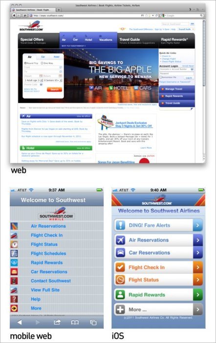 As an exercise - try to find the “Check In” button/link on the web version of Southwest’s site.
04/12/11
Is this the new mantra? Design for Mobile First.
Discover Today What Matters Tomorrow: The Thin Wisps of Tomorrow is Pascal Finette’s commentary into signals, trends, and drivers.
» About Pascal
» be radical
» The Heretic
» Disrupt Disruption